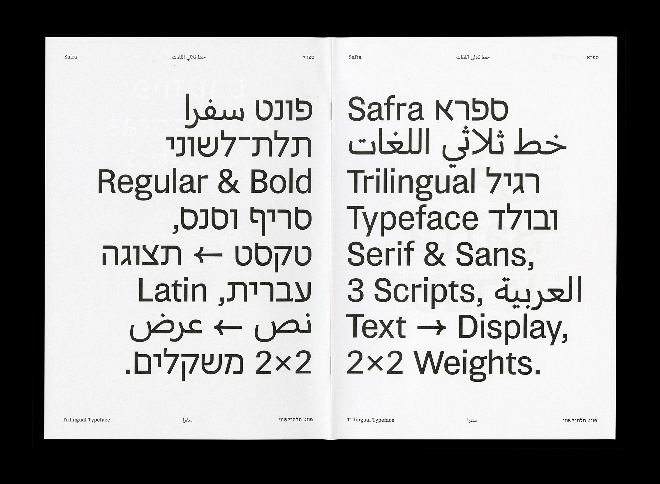
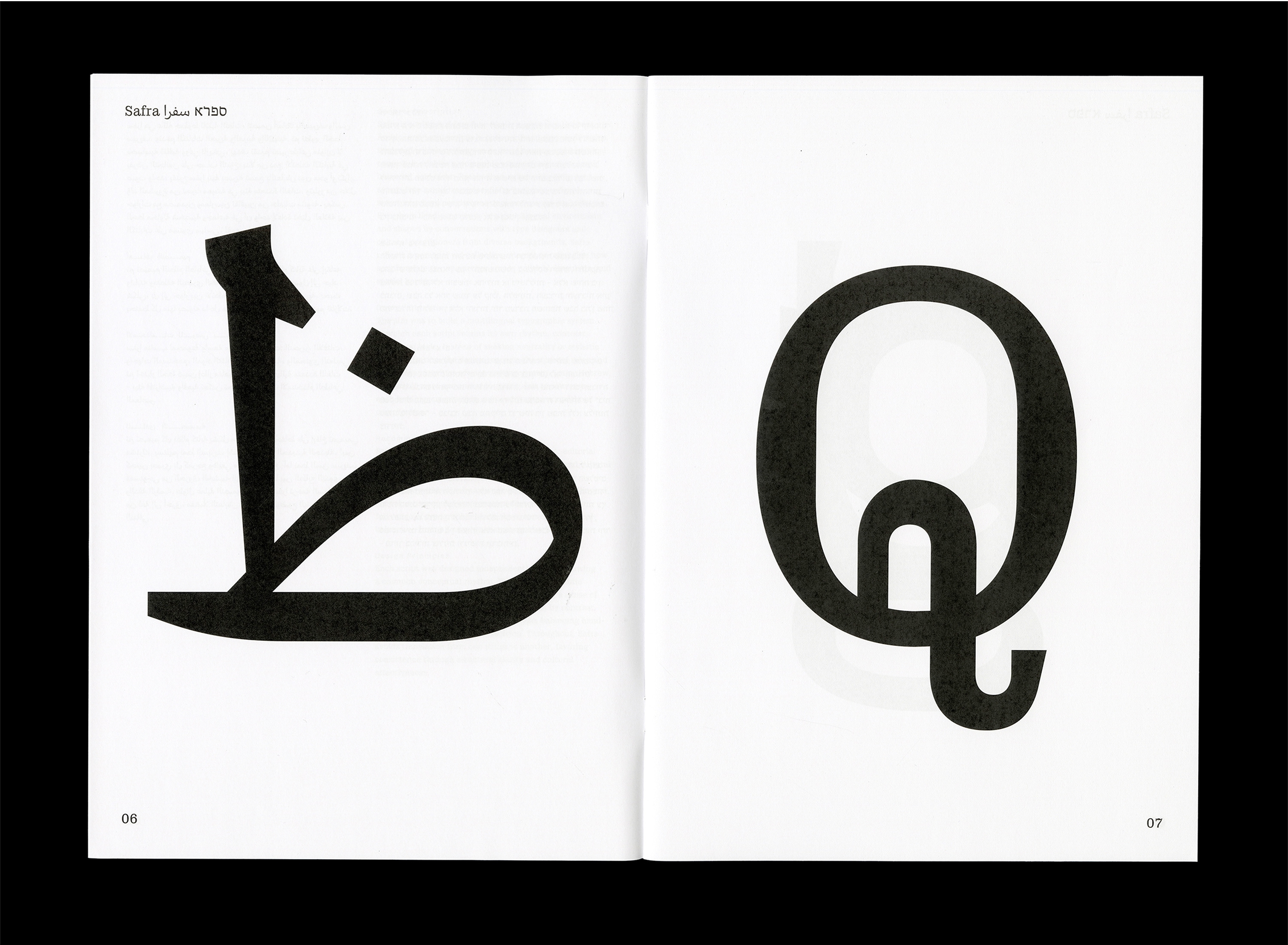
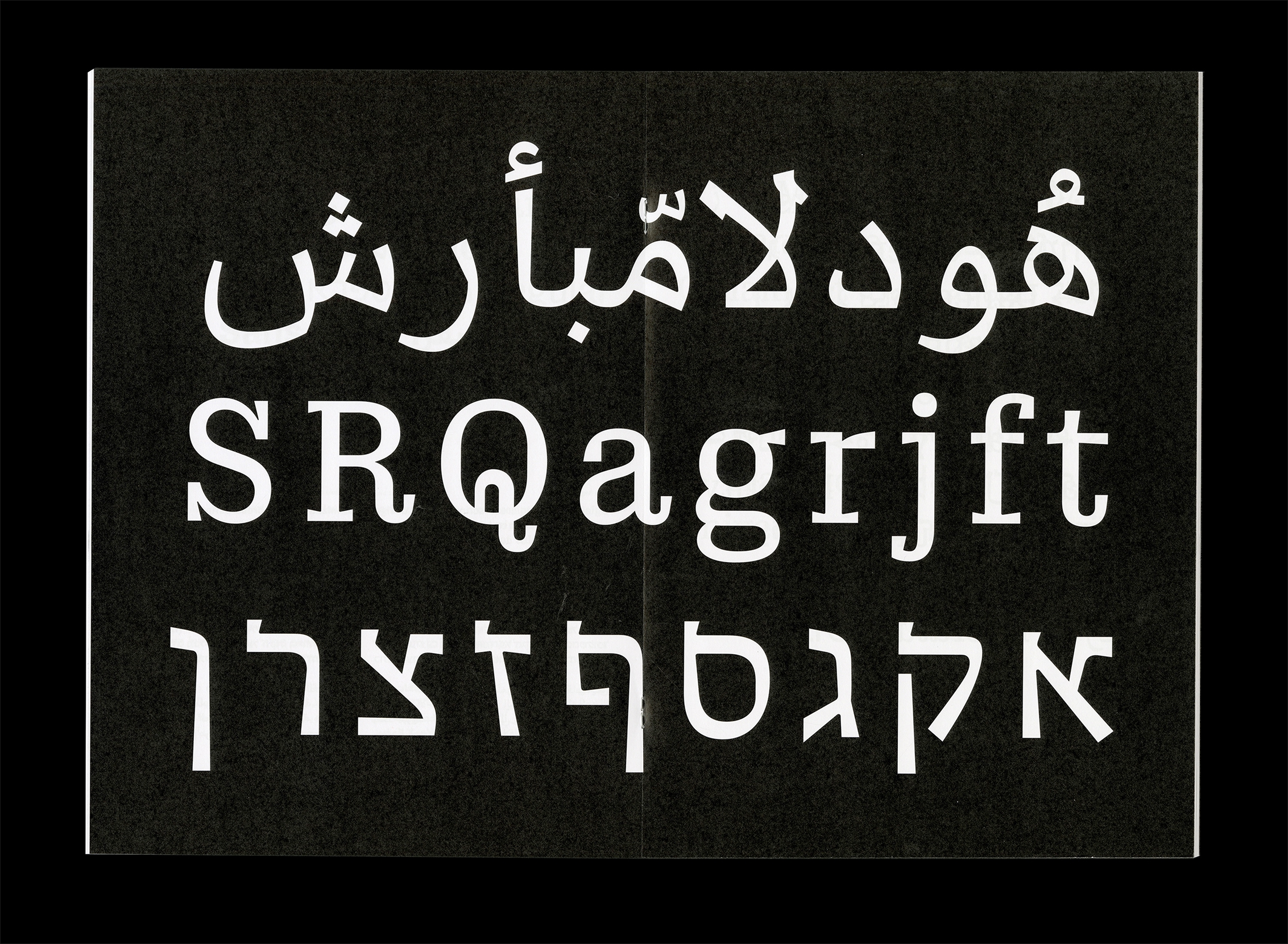
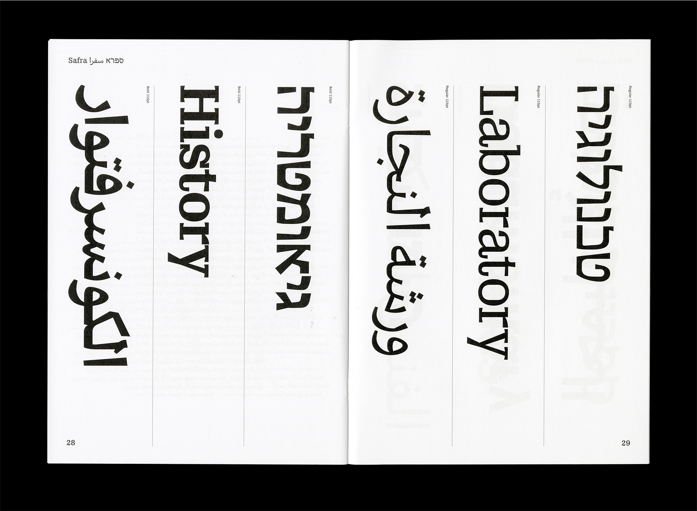
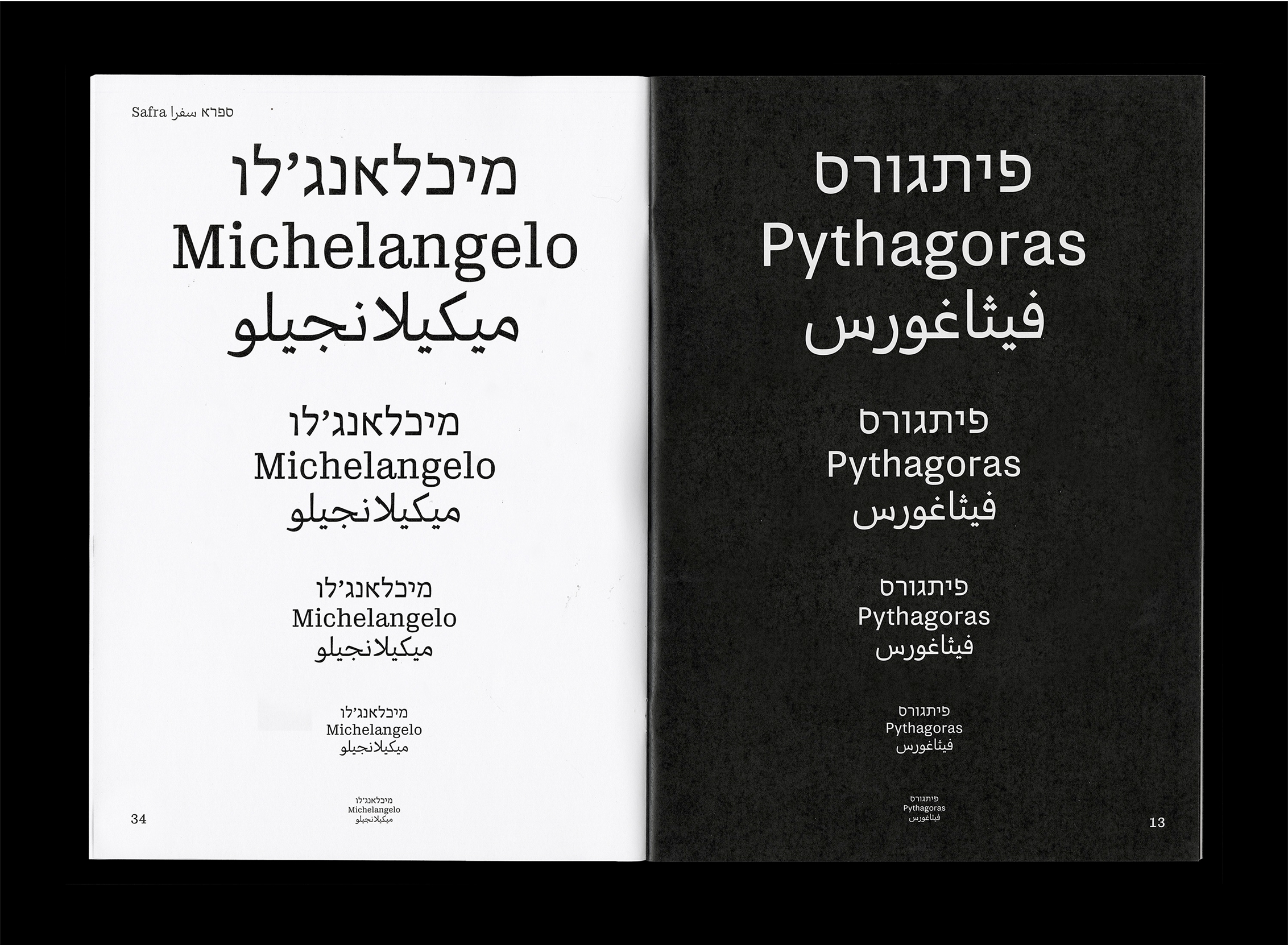
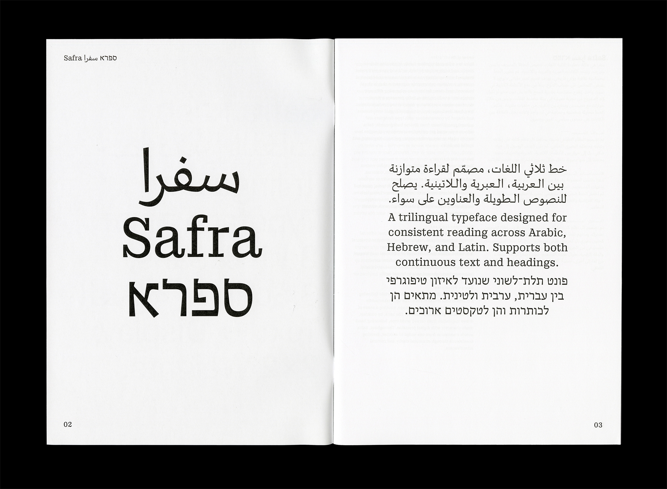
Safra ספרא سفرا is a trilingual typeface family comprising both serif and sans styles. Designed with a contemporary, low-contrast approach, it supports Hebrew, Arabic, and Latin scripts with clear and consistent typesetting across languages. Balancing structural differences while preserving the distinct voice of each script, it enables multilingual communication without forcing uniformity. The design functions as a bridge between writing systems, maintaining typographic integrity and visual harmony. Suitable for both extended reading and display use in cultural, educational, and public contexts.
Typeface: Safra سفرا ספרא
Designed by: Nir Zabari Yenni
Mentored by: Kai Bernau & Radim Pesko (ECAL MATD Diploma project)
Consultants: Michal Sahar, Wael Morcos, Titus Nemeth, Amir Mahdi Moslehi, Shaqa Bovand, Daniel Grumer, Nawal Arafat, Borna Izadpanah.
Year: 2025
Languages: Latin, Hebrew, Arabic
Formats: OTF, WOFF2
Regular רגולר عادي
Bold בולד عريض
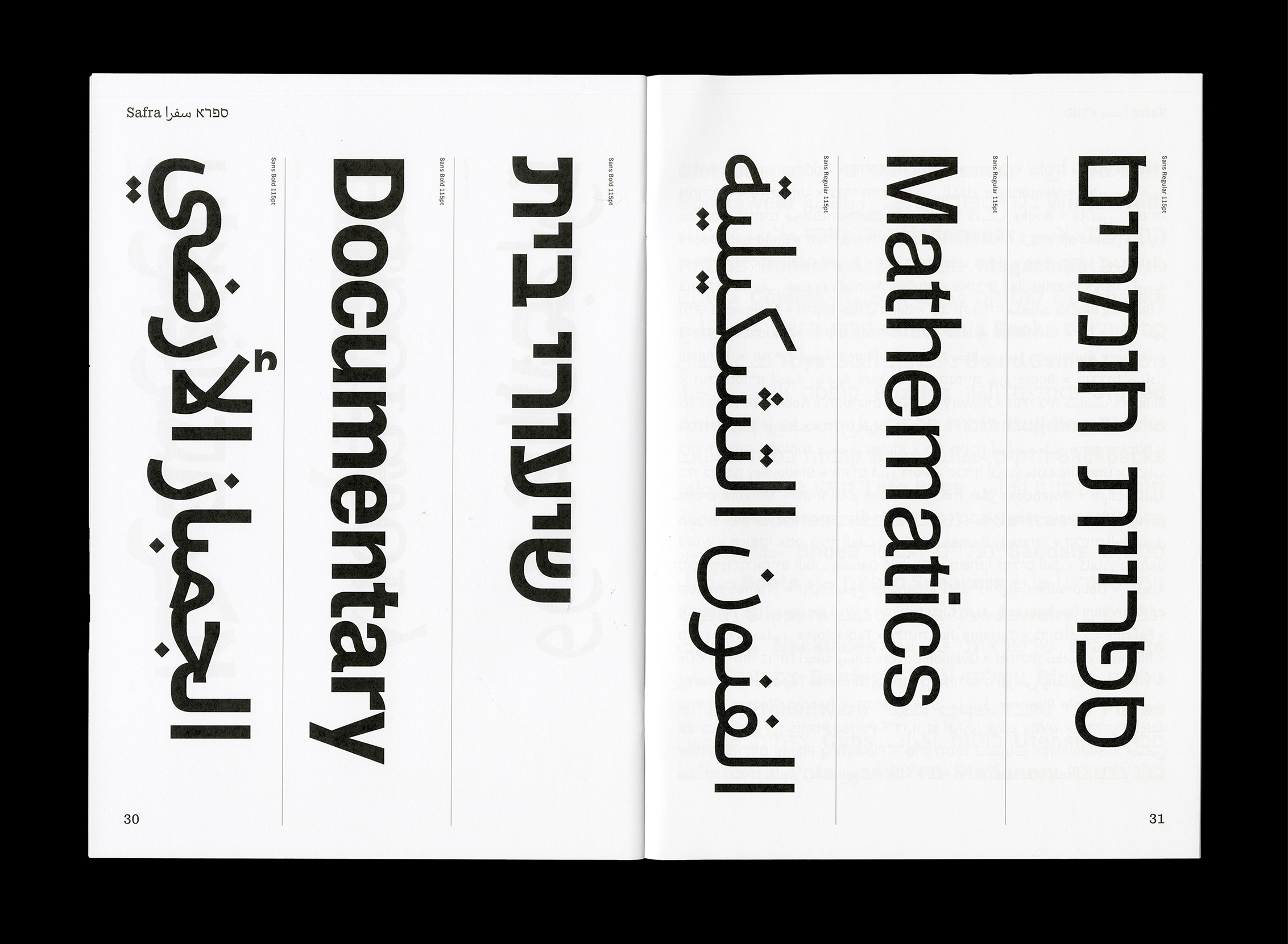
Sans Regular סנס רגולר سانس عادي
Sans Bold סנס בולד سانس عريض
Regular רגולר عادي
Bold בולד عريض
Sans Regular סנס רגולר سانس عادي
Sans Bold סנס בולד سانس عريض
Safra Regular
Safra is a trilingual typeface family supporting Hebrew, Arabic, and Latin scripts in both serif and sans-serif styles. Designed with regard to cultural context, it enables typographic expression that is plural, balanced, and clear. Rather than subsuming different scripts into a uniform voice, Safra proposes a visual structure where coexistence does not require assimilation. Born from lived experience in a multilingual environment and shaped by conversations with type designers and cultural practitioners from diverse backgrounds, Safra reflects a personal yet collective attempt to reimagine how scripts relate to one another across linguistic and spatial borders.
Safra Regular
هندسيّات
Safra Sans Regular
In a world where three languages coexist within the same physical and digital spaces — from government signage to schoolbooks, from train stations to mobile apps — the demand for a trilingual typeface has grown from a niche request to a practical necessity. Hebrew, Arabic, and Latin each carry rich typographic traditions, distinct spatial dynamics, and deeply rooted cultural associations. Designing a type system that allows these three scripts to share visual space without compromising their individual integrity is one of the most complex and rewarding challenges in contemporary type design.
A successful trilingual typeface must go beyond supporting Unicode coverage or basic character mapping. It must operate as a visual system that accounts for directionality, rhythm, modulation, contrast, and weight across scripts. Arabic flows right to left in a connected cursive form with frequent use of ligatures, baselines that dance and curve, and counters that open toward the left. Hebrew, also right to left, tends toward boxier forms and more consistent baselines. Latin, by contrast, is modular, open, and upright — a system that evolved with very different tools and visual logic. The design challenge lies not in reducing these differences, but in allowing them to coexist in ways that feel both intentional and balanced.
From a practical standpoint, designers working in multilingual contexts need a typeface that supports visual hierarchy across scripts. A bold headline in Arabic should feel equally prominent as its Hebrew and English counterparts. A paragraph of Hebrew should harmonize with Latin without looking too condensed or oversized. A Latin caption below an Arabic title shouldn’t feel like a typographic afterthought. These are not only matters of visual balance — they are decisions that reflect respect, legibility, and inclusivity.
The aesthetic strategies for achieving this vary. Some designers seek geometric consistency across scripts — aligning x-heights, cap heights, or stroke modulation. Others allow for greater divergence, trusting that layout and spacing will create harmony rather than uniformity. Both approaches have merit, depending on the intended use. For example, public signage might benefit from strict alignment for quick readability, while a cultural publication may embrace visual rhythm and contrast to evoke emotion or identity.
Trilingual typefaces are used in a wide range of applications: government documents, academic institutions, museum exhibitions, user interfaces, packaging, urban wayfinding systems, and more. In places like Israel, Palestine, and Lebanon — or among diasporic communities where multilingualism is a lived experience — these typefaces are not only functional, they’re essential. They serve as tools for communication, as visual evidence of plurality, and as cultural artifacts that bridge gaps between audiences who read the world differently.
And yet, the development of such typefaces remains relatively rare. Unlike global brands that often commission bilingual or pan-European fonts, few systems exist that thoughtfully and beautifully support Hebrew, Arabic, and Latin in equal measure. This is due in part to the complexity of the scripts themselves, but also to the cultural sensitivities required to do this work well. A type designer entering this space must ask: How do I honor each script’s visual voice? How do I balance neutrality with expressiveness? How do I ensure that no one script dominates the tone, simply because it’s more familiar to me?
Safra Sans Bold
שלום مرحبا Hello
Safra Regular
خط ثلاثي اللغات، مصمّم لقراءة متوازنة بين الـعربية، الـعبرية والـلاتينية. يصلح للنصوص الـطويلة والعناوين على سواء.
A trilingual typeface designed for consistent reading across Arabic, Hebrew, and Latin. Supports both continuous text and headings.
פונט תלת־לשוני שנועד לאיזון טיפוגרפי בין עברית, ערבית ולטינית. מתאים הן לכותרות והן לטקסטים ארוכים.
Safra Regular
מיכלאנג׳לו
Michelangelo
ميكيلانجيلو
Safra Sans Regular
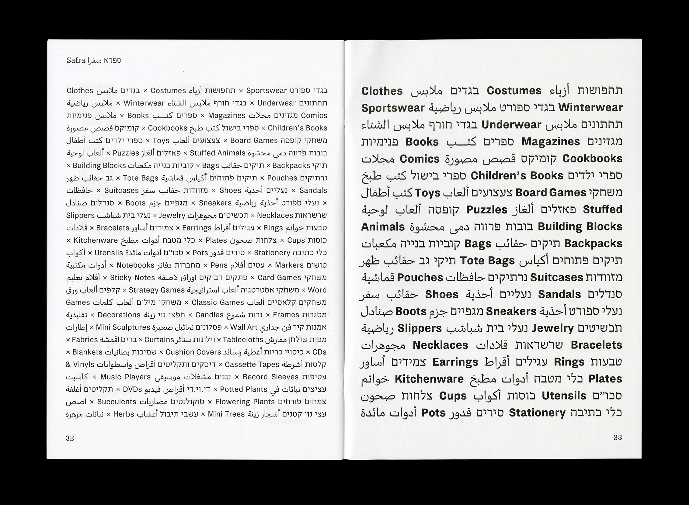
בגדים ملابس Clothes תחפושות أزياء Costumes בגדי ספורט ملابس رياضية Sportswear בגדי חורף ملابس الشتاء Winterwear תחתונים ملابس פנימיות Underwear ספרים كتــب Books מגזינים مجلات Magazines קומיקס قصص مصورة Comics ספרי בישול كتب طبخ Cookbooks ספרי ילדים كتب أطفال Children's Books צעצועים ألعاب Toys משחקי קופסה ألعاب لوحية Board Games פאזלים ألغاز Puzzles בובות פרווה دمى محشوة Stuffed Animals קוביות בנייה مكعبات Building Blocks תיקים حقائب Bags תיקי גב حقائب ظهر Backpacks תיקים פתוחים أكياس قماشية Tote Bags נרתיקים حافظات Pouches מזוודות حقائب سفر Suitcases נעליים أحذية Shoes סנדלים صنادل Sandals מגפיים جزم Boots נעלי ספורט أحذية رياضية Sneakers נעלי בית شباشב Slippers תכשיטים مجوهرات Jewelry שרשראות قلادات Necklaces
Safra Sans Regular
ספריית חומרים
Safra Regular
في عالم تتعايش فيه ثلاث لغات ضمن المساحات المادية نفسها من اللافتات الحكومية إلى الكتب، ومن محطات القطار إلى التطبيقات تحولت الحاجة إلى خط ثلاثي اللغات من طلب متخصص إلى ضرورة عملية. تحمل كل من العبرية والعربية واللاتينية تقاليد طباعية، وديناميكيات مكانية متميزة، وروابط ثقافية. يُعد تصميم نظام خطوط يتيح لهذه الأنظمة الثلاثة مشاركة المساحة البصرية دون المساس بسلامة أي منها أحد أكثر التحديات تعقيدًا وإرضاءً في تصميم الخطوط. يجب أن يقدم الخط الثلاثي أكثر من دعم تقني لتغطية Unicode أو تعيين الأحرف الأساسية. يجب أن يعمل كنظام بصري يأخذ في الاعتبار اتجاه الكتابة، والإيقاع، والتعديل، والتباين، والوزن عبر الأنظمة. تتدفق العربية من اليمين إلى اليسار بشكل متصل مع استخدام متكرر للربط، وخطوط أساس تتمايل وتنحني، ومساحات داخلية تفتح نحو اليسار. تميل العبرية أيضًا من اليمين إلى اليسار إلى أشكال أكثر تربيعًا وخطوط أساس أكثر اتساقًا. أما اللاتينية، بالمقابل، فهي نظام مفتوح، قائم، وموديولي تطور باستخدام أدوات ومنطق بصري مختلف تمامًا. يكمن التحدي التصميمي ليس في تقليل هذه الاختلافات، بل في السماح لها بالتعايش بطرق تبدو مقصودة ومتوازنة.
من الناحية العملية، يحتاج المصممون العاملون في سياقات متعددة اللغات إلى خط يدعم التسلسل الهرمي البصري عبر الأنظمة. يجب أن تبدو العناوين البارزة بالعربية بارزة بنفس القدر مثل نظيراتها بالعبرية والإنجليزية. يجب أن تنسجم الفقرة العبرية مع اللاتينية دون أن تبدو مضغوطة جدًا أو كبيرة الحجم. يجب ألا يبدو التسمية التوضيحية اللاتينية أسفل عنوان عربي كفكرة لاحقة طباعية. هذه ليست فقط مسائل توازن بصري — إنها قرارات تعكس الاحترام، والوضوح، والشمولية.
تختلف الاستراتيجيات الجمالية لتحقيق ذلك. يسعى بعض المصممين إلى الاتساق الهندسي عبر الأنظمة — مواءمة ارتفاعات الأحرف، أو ارتفاعات الأحرف الكبيرة، أو تعديل السكتات. يسمح آخرون بمزيد من التباين، معتمدين على أن التخطيط والتباعد سيخلقون التناغم بدلاً من التماثل. كلا النهجين لهما قيمة، اعتمادًا على الاستخدام المقصود. على سبيل المثال، قد يستفيد التوقيع العام من المحاذاة الصارمة للقراءة السريعة، بينما قد يحتضن منشور ثقافي الإيقاع البصري والتباين لإثارة العاطفة أو الهوية.
تُستخدم الخطوط الثلاثية في مجموعة واسعة من التطبيقات: الوثائق الحكومية، المؤسسات الأكاديمية، المعارض المتحفية، واجهات المستخدم، التغليف، أنظمة التوجيه الحضري، والمزيد. في أماكن مثل إسرائيل، فلسطين، ولبنان أو بين المجتمعات الشتاتية حيث التعددية اللغوية تجربة معيشية، وهذه البيئات المتجاورة، هذه الخطوط ليست فقط وظيفية، بل ضرورية. إنها تخدم كأدوات للتواصل، كدليل بصري على التعددية، وكقطع ثقافية معبرة ومتنوعة تجسر الفجوات بين الجماهير الذين يقرؤون العالم بشكل مختلف.
ومع ذلك، لا يزال تطوير مثل هذه الخطوط نادرًا نسبيًا. على عكس العلامات التجارية العالمية التي غالبًا ما تطلب خطوطًا ثنائية اللغة أو أوروبية شاملة، توجد أنظمة قليلة تدعم العبرية، والعربية، واللاتينية بشكل مدروس وجميل بالتساوي. يرجع ذلك جزئيًا إلى تعقيد الأنظمة نفسها، ولكن أيضًا إلى الحساسيات الثقافية المطلوبة للقيام بهذا العمل بشكل جيد. يجب على مصمم الخط الذي يدخل هذا المجال أن يسأل: كيف أكرم الصوت البصري لكل نظام؟ كيف أوازن بين الحيادية والتعبير؟ كيف أضمن ألا يهيمن نظام واحد على النغمة، لمجرد أنه أكثر ألفة بالنسبة لي.
Safra Sans Regular
בעולם שבו שלוש שפות מתקיימות זו לצד זו באותם מרחבים פיזיים ודיגיטליים משלטי ממשלה ועד ספרי לימוד, מתחנות רכבת ועד לאפליקציות הדרישה לפונט תלת־לשוני עברה מבקשה נישתית לצורך פרקטי של ממש. עברית, ערבית ולטינית נושאות עמן מסורות טיפוגרפיות, דינמיקות מרחביות ואסוציאציות תרבותיות. עיצוב מערכת אותיות שמאפשרת לשלוש מערכות כתב לחלוק מרחב חזותי מבלי לפגוע בשלמות של אף אחת מהן הוא מהאתגרים המספקים ביותר בעיצוב גופנים. פונט תלת־לשוני מוצלח חייב להציע יותר מאשר תמיכה טכנית ב Unicode או מיפוי של תווים. עליו לתפקד כמערכת חזותית המתייחסת לכיוון כתיבה, קצב, מודולציה, ניגודיות ומשקל באופן המתאים לכל כתב. הכתב הערבי זורם מימין לשמאל בצורת כתיבה מחוברת עם שימוש תדיר בליגטורות, קווי בסיס מעוקלים ודינמיים ותיבות פנימיות הפונות שמאלה. העברית, גם היא מימין לשמאל, נוטה להיות קופסתית יותר ובעלת קווי בסיס יציבים. הלטינית, לעומתן, היא מערכת פתוחה, אנכית ומודולרית שנוצרה מתוך כלים לוגיים ועיצוביים. האתגר העיצובי איננו למחוק את ההבדלים, אלא לאפשר להם להתקיים יחד באופן מכוון ומאוזן.
Safra Sans Bold
fragile
Safra Sans Regular
الخط الثلاثي ليس حلًا عمليًا للعمل متعدد اللغات. إنه جسر بين ثقافات وبين طرق رؤية. إنه يتيح للقارئ العربي أن يقرأ نصًا بجانب القارئ العبري دون أن تطغى الطباعة أو تُقصي. إنه يدعو القارئ إلى اللغات المختلفة في الصفحة نفسها، في المساحة نفسها، دون أن تطغى إحداها على الأخريات. بهذا المعنى، يُجسّد الخط الثلاثي رؤية للعيش المتوازي، ليس اندماجًا بل جوارًا، ليس توحيدًا قسريًا بل تعددية دقيقة. إنه يمنح المصممين القدرة ليس فقط على ترجمة النصوص، بل على تصميم هياكل تُمكّن أصواتًا مختلفة من أن تُسمع. في عصر الترجمة والاتصال، يصبح الخط واجهة تُجرى فيها مناقشة بين اللغة والهوية البصرية والقدرة على رؤية الآخر ليس كاستثناء بل كجزء من التصميم ذاته.
Safra Sans Regular
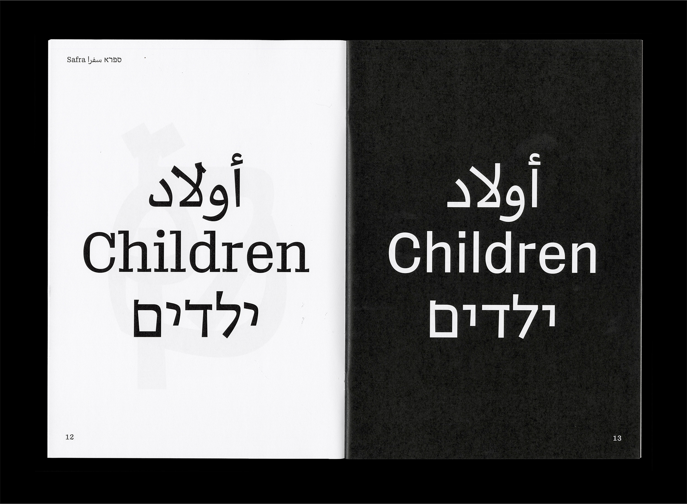
ילדים
Children
أولاد
Safra Sans Bold
This is where multilingual type design becomes more than a technical challenge, it becomes a political and cultural act. To design with and for three scripts is to acknowledge the histories they carry, the tensions they hold, and the future they shape. It is a process of negotiation, of deep listening, of cross-referencing shape and meaning across lines that are often divided. A trilingual typeface doesn't just translate words. It embodies coexistence. It allows for parallel presence without forced fusion. It gives designers the tools to write in three languages — and to be understood in one shared typographic space. A trilingual typeface doesn't just translate words. It embodies coexistence. It allows for parallel presence without forced fusion. It gives designers the tools to write in three languages — and to be understood in one shared typographic space.
Safra Regular
Unicode decimal: 97
Unicode hex: 0061
HTML entity: a
Unicode hex: 0061
HTML entity: a
Safra ספרא سفرا in Use
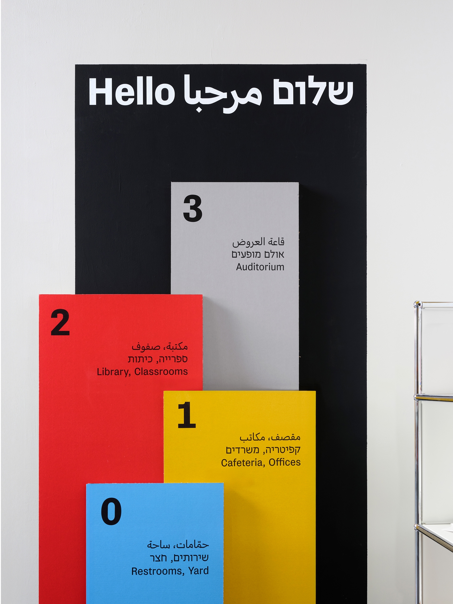
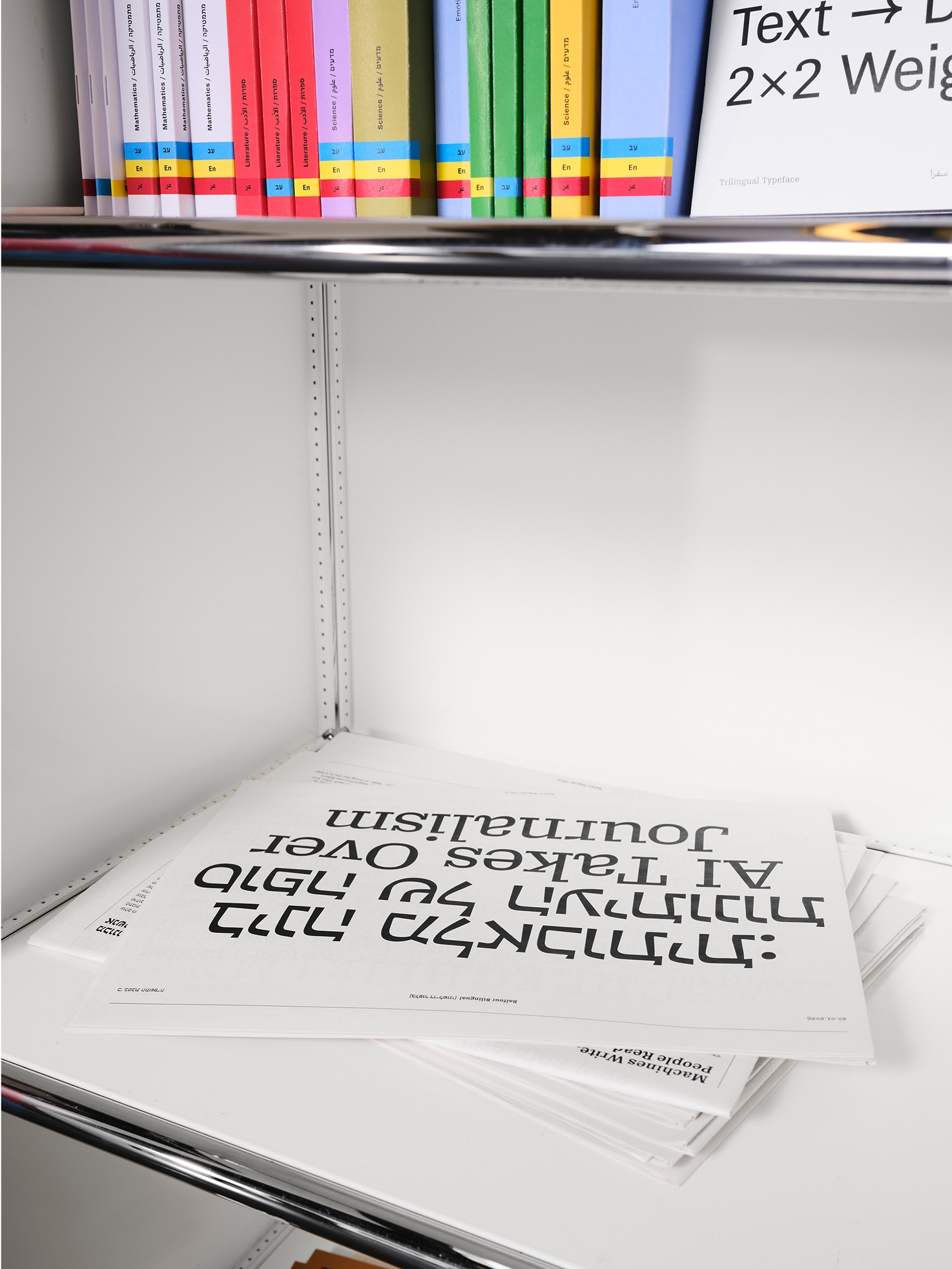
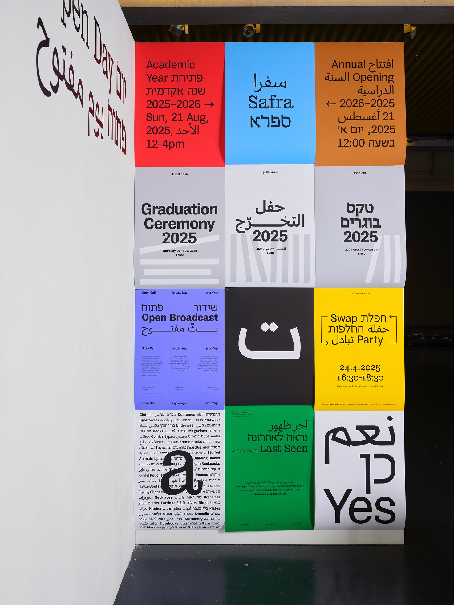
Photos by Visvaldas Morkevicius
Specimen