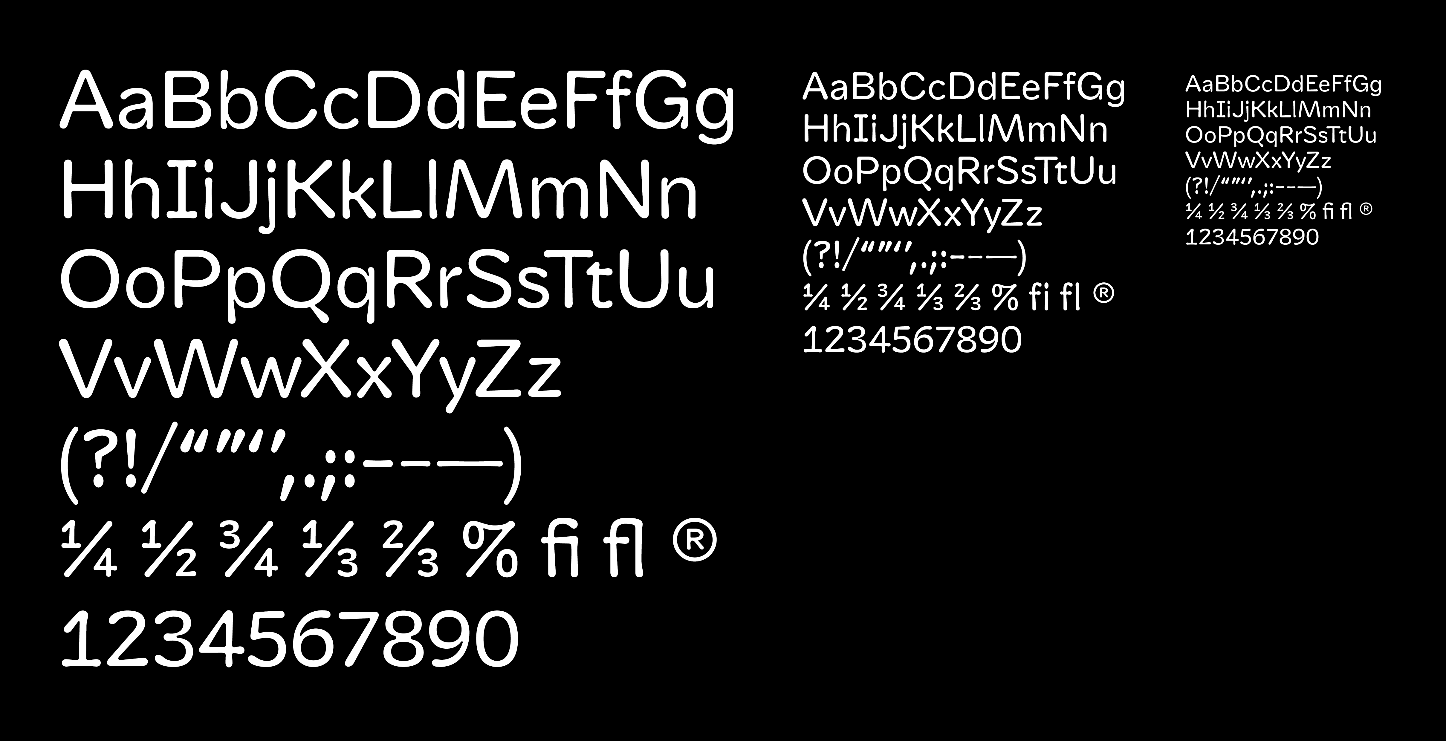
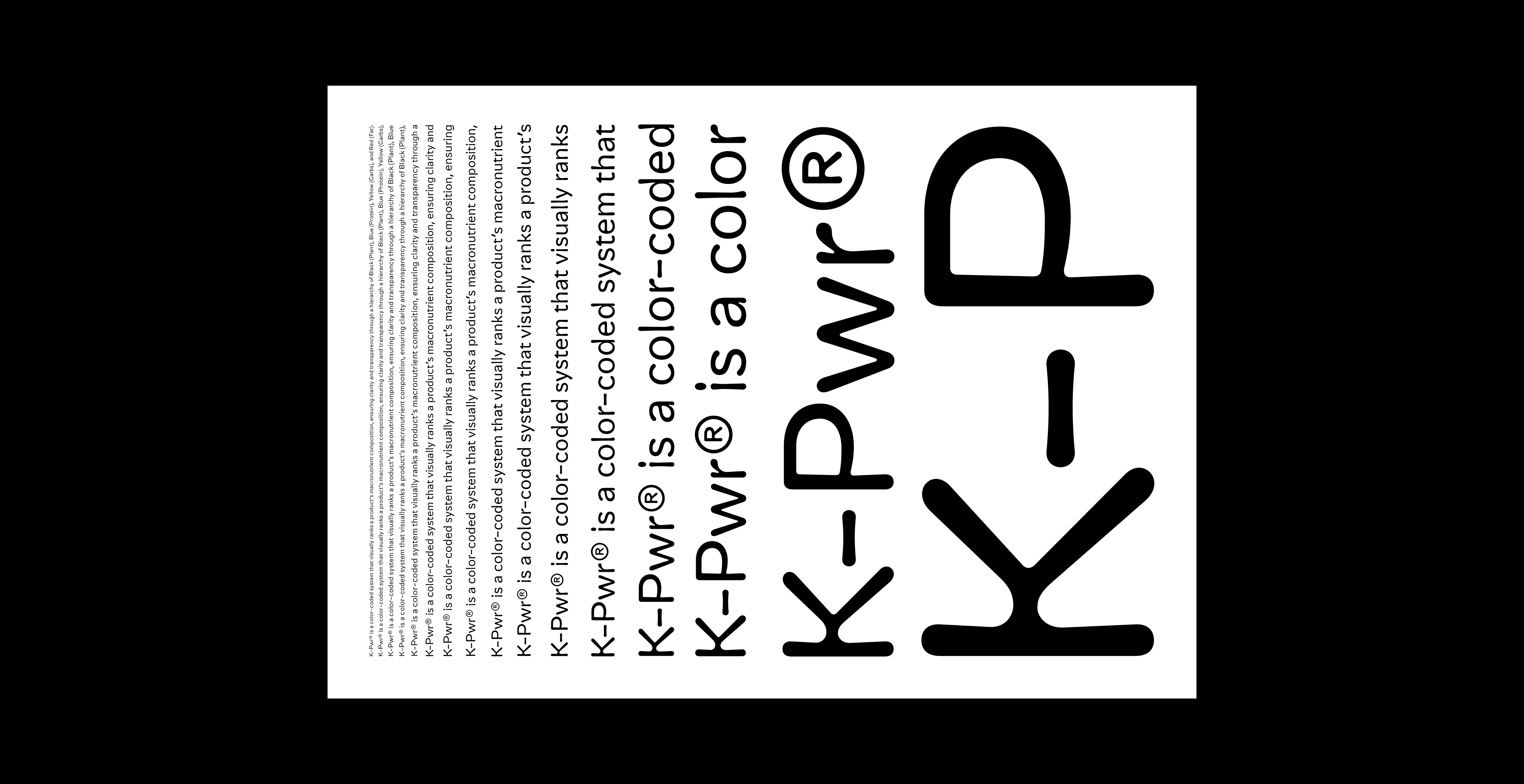
Kilo Text is a contemporary typeface designed for extended reading and editorial use. With its clean, readable character and thoughtful spacing, Kilo Text provides excellent legibility across various text sizes and contexts. The typeface balances modern aesthetics with functional design, making it ideal for body text, magazines, books, and digital publications. Its carefully crafted letterforms ensure comfortable reading experiences while maintaining visual interest and typographic sophistication.
Typeface: Kilo Text
Designed by: Nir Zabari Yenni
Mentored by: Radim Pesko (ECAL)
Year: 2025
Languages: Latin
Formats: OTF, WOFF2
Style: Text
Use: Editorial, Body Text, Digital
Kilo Text Regular
Kilo Text Regular
Kilo Text Regular
Kilo Text Regular
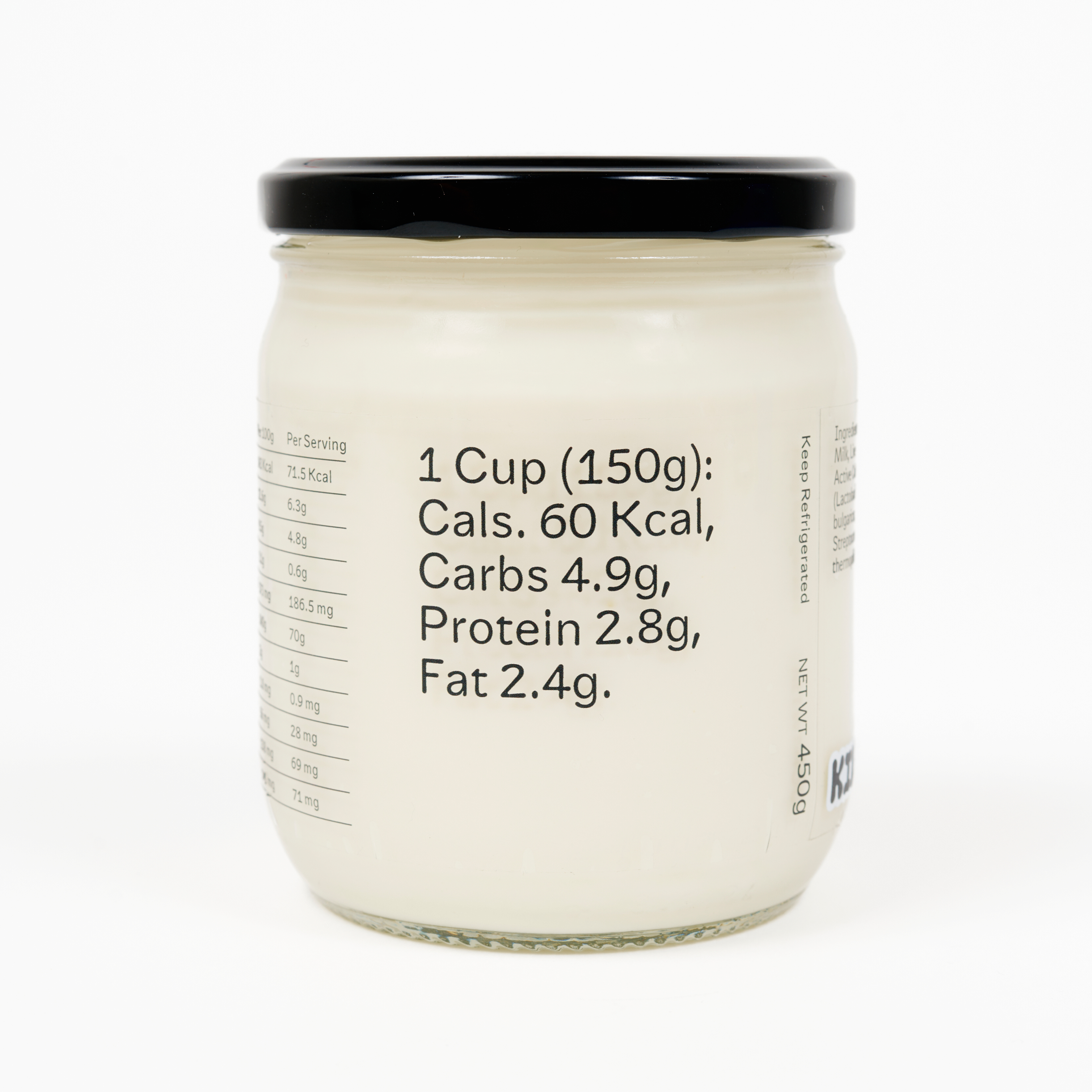
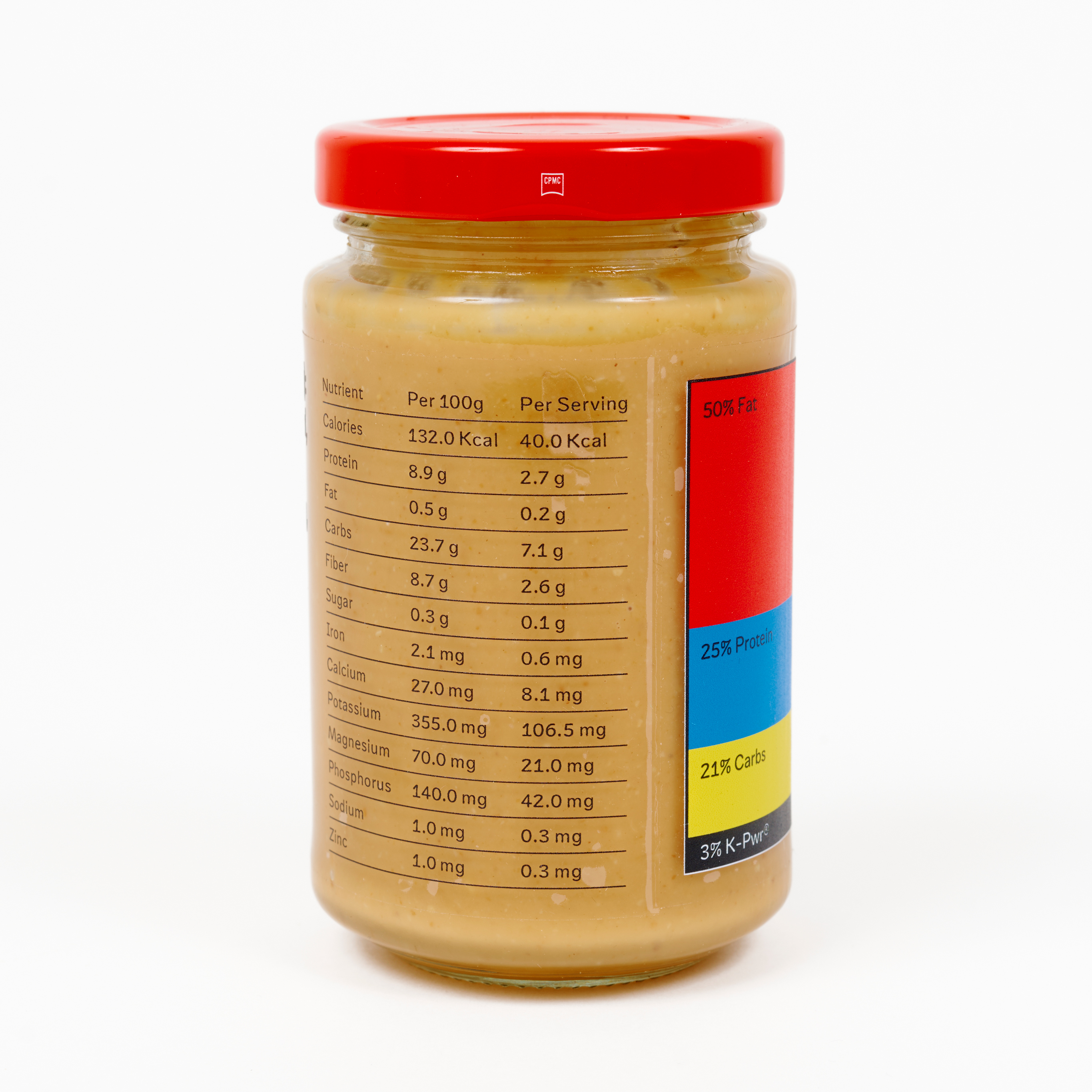
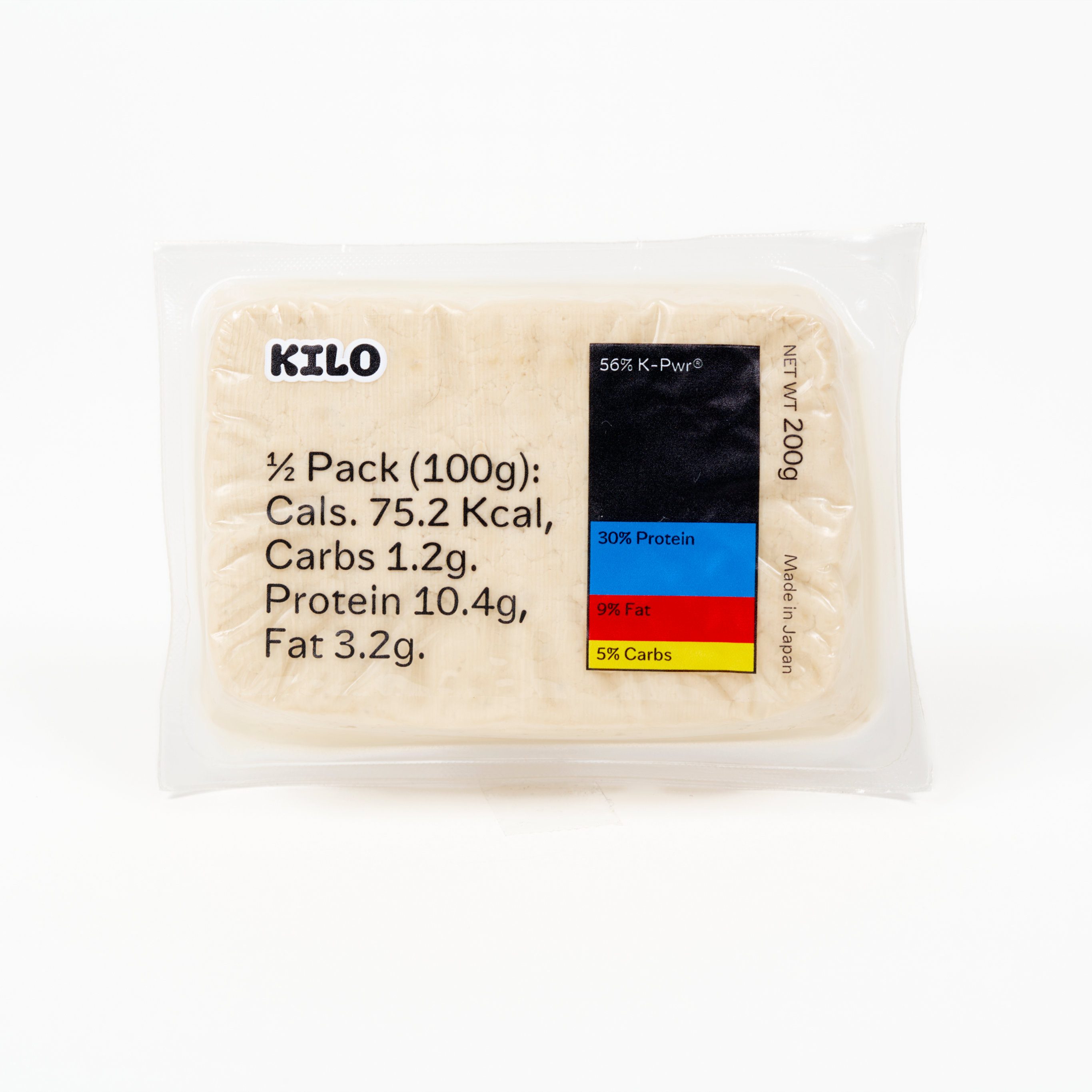
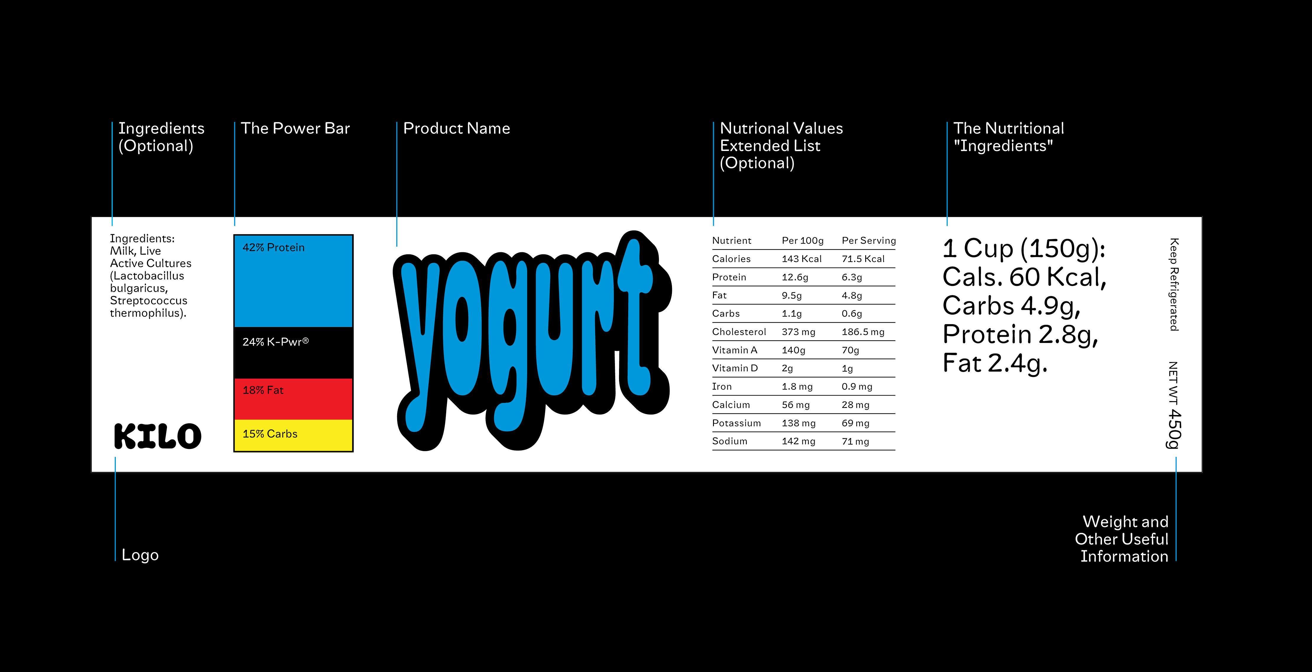
KILO was born from a simple yet powerful idea: to redefine how we connect with the most essential foods in our lives. Inspired by the beauty of minimalism and the boldness of typography, KILO creates packaging that goes beyond functionality to tell a story. At its core, KILO champions the belief that everyday nutrition deserves the same level of thoughtful design as any luxury product. With a focus on whole, unprocessed ingredients like vegetables, grains, and proteins, KILO celebrates simplicity, transparency, and sustainability. Every detail—from the K-PWR Bar's vibrant colors to the carefully crafted typography—has been designed to inspire trust, clarity, and a connection to the food we consume. KILO's mission is not just to package food but to empower consumers with a clean, clear, and empowering experience. Whether you're grabbing a bag of quinoa or a jar of peanut butter, KILO makes you feel like you're making a choice that's good for you, and good for the planet.
KILO Text is the functional, highly legible counterpart to KILO Display, designed specifically for text sizes, nutritional facts, packaging labels, and both print and digital applications. While KILO Display is bold, expressive, and attention-grabbing, KILO Text prioritizes clarity, balance, and readability—making it ideal for continuous reading in recipes, ingredient lists, and product descriptions. With its rounded, geometric structure, KILO Text maintains a friendly and approachable tone, complementing the visual language of the brand. Its open counters enhance legibility at smaller sizes, ensuring that crucial information, like nutritional values and packaging details, remains clear and accessible. KILO Text and KILO Display share the same rounded, organic DNA, defining the KILO brand. While KILO Display is bold and playful, KILO Text refines those elements into a functional, highly readable typeface. Together, they create a cohesive system—Display for attention-grabbing headlines, Text for clear product details—ensuring both expressiveness and practicality across packaging, print, and digital applications.
Butter Cookies in ¼ Hour
-----------
Ingredients:
- ½ cup sugar
- ¾ cup flour
- ¼ tsp salt
- 100 g soft butter (50% fat)
-----------
Instructions:
1. Mix sugar, flour, and salt.
2. Add butter and knead until smooth.
3. Bake at 180° for 10–12 min.
-----------
Unicode decimal: 97
Unicode hex: 0061
HTML entity: a
Photos by Visvaldas Morkevicius
